
From the Vault: Lhurgoyf 8th Ed (2003) Pt. 3
The rejection of the first sketch came as a blow, especially given how long I’d spent trying to nail down a composition I was happy with.
The people responsible for signing off on Magic art (chiefly the art director and at least one member of story and R&D) felt that the Lhurgoyf was too thin and lacked the power that was associated with this fearsome creature. I pointed out that the new Lhurgoyf was actually a little more muscular than his predecessor, but this fell on deaf ears. They wanted me to make him bigger and tougher. I had to scrap the foreshortening notion as that was going to be counterproductive to making the figure look larger.
I took the head from the previous sketch and repositioned it around the image, building potential new poses around it. Here’s a few of them –
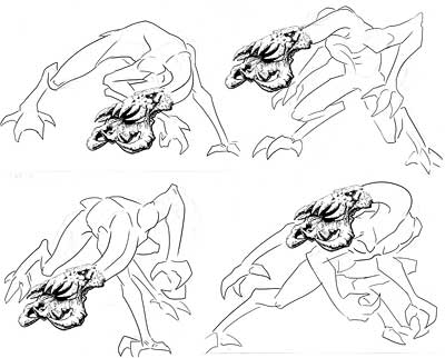
The lower two seemed to be the most promising so I started to explore a crouching, maybe cornered and angry Lhurgoyf with increasingly detailed renderings. The ones below are the more important ones from several created as I scrambled to find a final pose within the approaching sketch deadline. Note, all three have almost the same leg and arm positions with just minor cosmetic variations. The position of the torso and head were proving to be the tricky part”¦
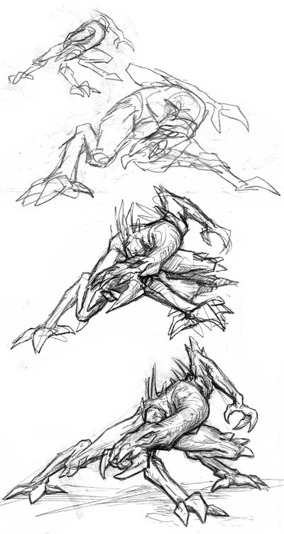
I took the middle design and worked up a better image. I made the head larger and the neck a little more muscular. The new image certainly had some nice dynamism and there’s a real tautness as if the Lhurgoyf is about to spring into attack but… well, there’s a readability problem.
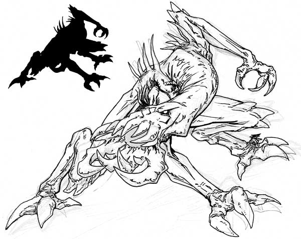
So much of the important anatomy is tied into a tight little spot in the middle of the figure. With a book cover this would be less of a problem but on the tiny image window of a Magic card there was a very real danger that the figure would become a muddled indistinguishable assortment of limbs. To spotlight what I mean take a look at the small silhouette of the pose I’ve provided in the upper left of the image. As you can see the outline of the head is lost in the image.
So I was going to have to come up with something else, and the sketch deadline was getting closer and closer.
Way more interesting pose than what they eventually used! Too bad the card art is so small, ’cause that ‘goyf looks great!
Stardust, while I think it’s more intense than the final pose, the readability issue wins out.