
From the Vault: Lhurgoyf 8th Ed (2003) Pt. 4
The current sketch’s readability issue was really just related to where the head was, so I moved the head up to the upper left of the image. This kept the center of the figure uncluttered, gave the head a prominent location in the image and filled a growing area of dead space in the upper left of the picture. Win/Win! It fixed a whole host of issues and as a bonus, also gave the Lhurgoyf a more defiant, aggressive look. Probably a good thing as WotC wanted an image that exemplified the power of a pumped-up Lhurgoyf.
Here’s the second completed sketch I sent for approval.
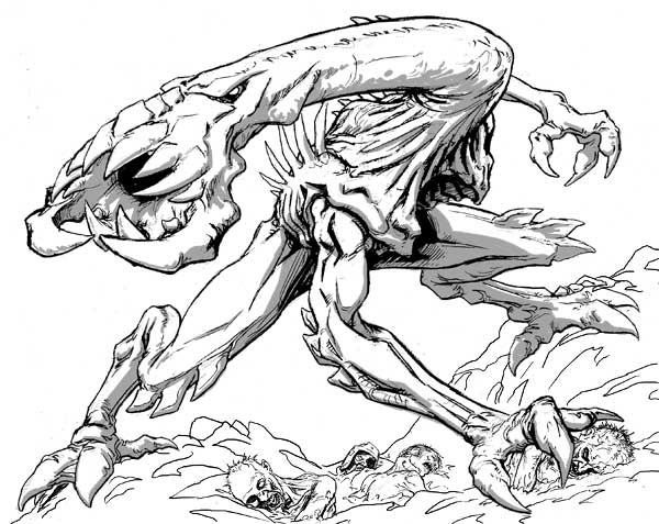
Again, I’ve added shade to lend mass to the figure and to help define shapes within its form. At least one of the corpses is lifted from the first sketch… hey, no point wasting them!
And yes, the Lhurgoyf got even bulkier. During the course of these drawings I hit upon the notion that the Lhurgoyf we saw in Ice Age was very emaciated and undersized due to the constant struggle of finding a good meal. The new Lhurgoyf is living in a sub-arctic Dominaria (note the pine trees in the background) and rarely stays hungry long. It still has a taste for the dead and in the new image is digging up a burial mound. It’s probably turning at the shouts of nearby villagers who’ve just discovered their recently buried relatives are on the Lhurgoyf’s menu. I imagine the flavortext as “œAch! The Lhurgoyf’s in Great-Uncle Hans’ burial mound again!” as a riff on the original’s.
Thankfully the image was accepted.
As much as I was originally very disappointed that the first image had been rejected, I was happy with that decision now as I felt the new sketch was a substantial improvement over the first.
Here’s a color rough I whipped up to give me an idea where I wanted to go with the palette in the image.
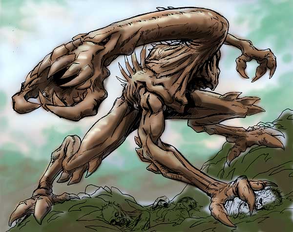
This was pinned next to the painting as I worked and helped me with color mixing. Ah, the days of painting in acrylics. I miss them but I’ll probably never go back as my eyestrain limits me to working digitally. Too much time spent staring at a canvas a few inches from my face, you see.
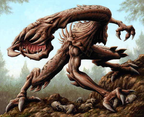
And finally, here’s the finished piece.
Funnily enough the colors aren’t that similar to the color rough. The rough is a starting point, but I drifted into more saturated colors when working on the finished painting. Of course, how my ever-cranky printer might have printed out the color rough might have something to do with the color drift too.