
Zakis Trickstab (2010) WIP Part 2
On to the painting of the goblin. I have a few methods for painting pieces. They’re not wildly different, but there’s methods that work better for some images than others. However, almost all of them start with me blocking out the colors. ‘Blocking out’ refers to applying areas of flat color across an entire image to mark clearly what color (minus shadows and lighting) everything should be. I think my comic books roots are showing…
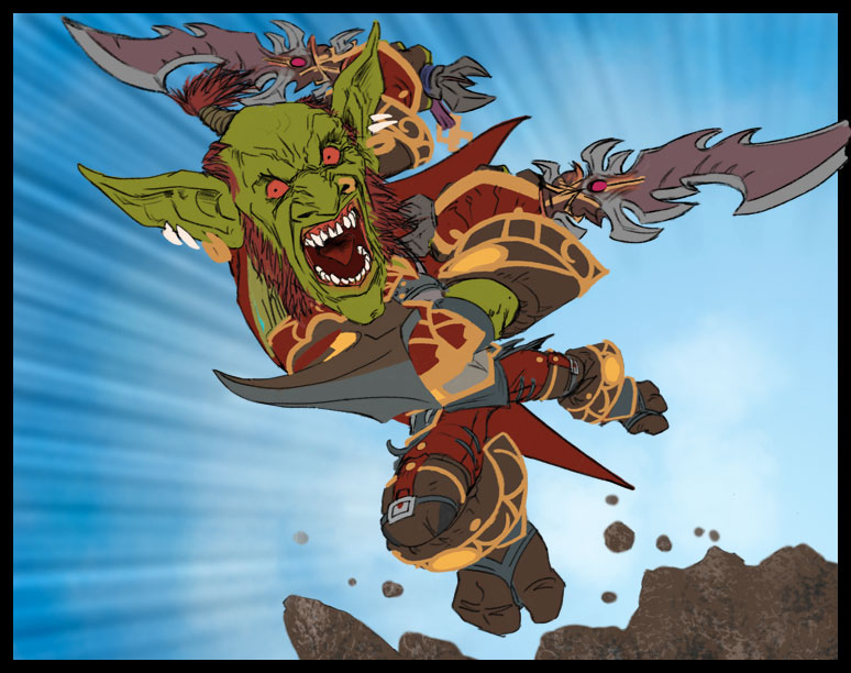
This image shows a couple of other elements I wanted to define early; the speed lines which were created by filling a path of radial lines and then erasing the lines in the lower right (think of it like a stencil) and the rocks which for some inexplicable reason I wanted to add some texture to. I try to avoid adding texture too early because it makes any sculpting of forms harder because the texture becomes clutter that has to be maintained across multiple applications of ‘paint’. It’s a bad habit I have that creeps in when I’m lacking a little confidence about something. It’s akin to an artist hiding the faults in a drawing with a slew of cross-hatching and when the drawing’s done those faults will still diminish the final quality of the image. Always try to get your forms right because if not, they undermine everything that follows. Well, anyway, I apparently still fall into this trap in places but thankfully it was only the rocks!
Also you may have noticed that the sky is a little patchy. This is intentional as having large areas of color be flat or perfectly blended always feels a little artificial so I like to throw a little grime in there. Still, that probably could have waited until later too. Guess I was eager!
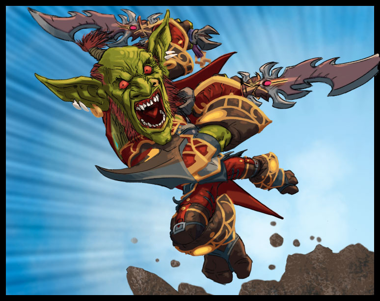
So this may seem like a significant jump but it’s actually a pretty quick process though a little odd if you don’t know Photoshop. Bear with me…
The change from the first image to the second is just the addition of highlights and shadows but I do this in rather a curious way; I duplicate the goblin’s block color layer so I have three copies. One of these is untouched and is considered the base layer. The second is given an even dose of the color of the image’s sunlight using Fill with Overlay to make everything brighter and warmer. The third also uses Fill but with a Multiply effect and using the blue of the sky as that is most likely to be the reflected color in the shadows. These two highly tinted layers are then obscured by layer masks and I paint into the mask reintroducing the highlights and shadows where appropriate. It’s not the most organic of methods but it gets me a good underpainting quickly with a consistent color-shift that helps hold the piece together quickly at such an early stage.
Give it a try sometime, but after applying with Fill be sure to make use of the Fade option to find what intensity of the fill works before starting to use the layer masks. You’re looking for a shift in the color that feels like the upper end of bright sunshine (or whatever the primary light source is) on the object and what feels like a nice deep shadow. Using opacity brushes to paint these back in you can use the extremes of these colors sparingly and go for more subtle shading for most of the image.
I now have pretty accurate base, highlight and shadow colors. That’s what I call an underpainting. And that leads me to;
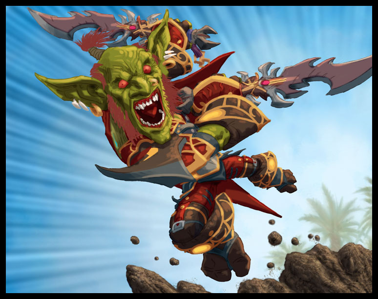
Not a lot has changed here and it might even seem like a step backward. What’s happened is that all those black lines that held the image together have been removed making it seem less finished. The black lines were in their own layer and I used that layer as a selection, copied the color from the three block color layers (once they were flattened together), darkened it a little with Hue/Saturation and voila, all the detail of the black line layer but with appropriate color. This line does need toning down near highlights but for everything else it’s a quick way of carrying over the detail into the image so that when I paint I can use either Artrage or Photoshop CS5’s fancy new blender brushes to push around the paint and still have the lines as guides with no unwanted black being picked up by the brushes.
Next I give the background some attention. The rocks get more solid shadows to help with form, some palm trees appear way in the distance to give a simple visual clue to location without interfering with the simplicity of the image, and the sky gets a few faint applications of light blue to fade the zoom lines where they approach the figure as they’re an element that’s meant to enhance the goblin not fight for the viewer’s attention.