Moving Along

•October 2, 2022 • Comments Off on Moving Along

We’re getting ready to move house, and as you probably know, moving is one of the biggest upheavals there is. We’re not moving far from Seattle, but far enough that my old PO Box has come to the end of its 10+ year run.

So, I’m not accepting any cards by mail for the immediate future, and I won’t be offering any artist proofs or prints for sale until at least Feb April 2023. When my store does reopen, there’s gonna be some shake-ups:

Cards sent to be signed from within the US will go to my new shiny future PO Box. Signatures will be $2 apiece and shadow signatures will be $5. The freebie 20 sigs up front is finally being put to rest. It had a good run, but unfortunately people still chose to abuse it.

Cards sent to be signed from outside the U.S. are no longer going to my PO Box. For those cards, you’ll need to contact Mark Aronowitz and take advantage of his excellent signing service (Facebook link).

The hard truth is that handling large numbers of overseas packages has become a major timesink, with the ever-changing customs forms and the increasingly expensive fees. The great thing about Mark’s service is you can ship him cards for a huge swath of Magic artists in one single package, which cuts down on that initial shipping cost considerably. Yes, there’s a few more hoops to go through to get your cards signed, but if you ever wanted to send a bunch of cards with specific color requests for each one, you can do that!

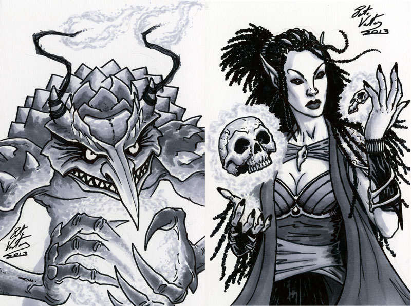
I’ve not been selling most of my artist proofs via mail for much of the pandemic. They were in need of a full inventory and re-pricing, and I finally got that done. However, the big move makes it difficult to commit to when they’ll be available again as my future is filled with a lot of clearing, sorting, and storing. Eventually, I even hope to get the full sets of around 400 APs prepped for sale. When they are, there will be plenty of notice given. And no, I don’t know what the price point will be yet.

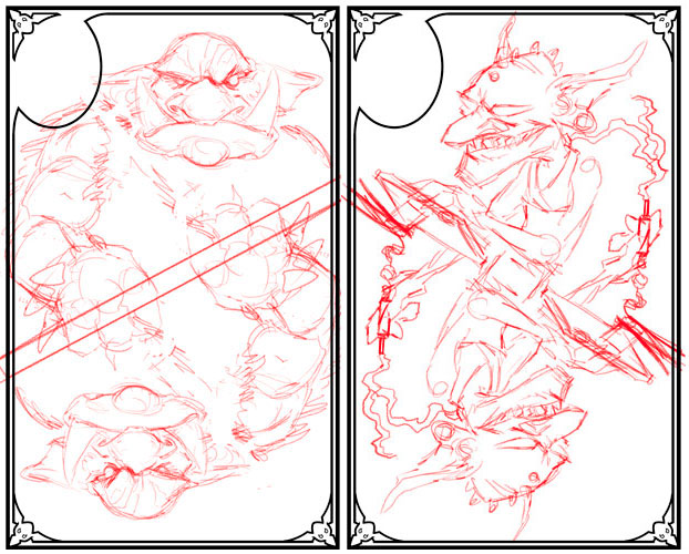
Once the store reopens, sketch commissions and AP purchases will still come to me for the foreseeable future. That may change, but that’s the current plan at least. In-between some awesome Magic assignments, I’ve been trying to get caught up on my humungous backlog of private commissions. I’m still whittling away at that list but moving house means I have to ask everyone for continued patience (I am really sorry, you peeps have been very kind). I won’t take any other private commissions until they’re done, and I’m not making a waiting list. When these pieces are finally done, it’ll be a clean start.

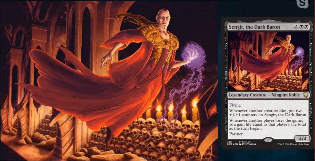
Finally, prints. For well over fifteen years I’ve offered a little over fifty of my Magic images as 8.5″ by 11″ prints on matte art paper. Sometime in 2023, I hope to offer an even broader range of pieces and new print options via an online store. That’s a change I’m really excited about but it’ll also be the last piece of the puzzle cos… well, yeah, just look at everything above!

Who knows, maybe next year, I’ll even find a new theme for this blog? The old one broke… a while ago.

Return of the Baron

•August 22, 2020 • 3 Comments

So you may have just seen Wizards reveal a new Baron Sengir painting by me. Is it real? Is it digital or traditional? Buckle up…

Back in the ancient times – we like to call them “2019” – Commander Legends was announced with a preview of two pieces of art – one of which was a new Baron Sengir.

Now, I liked the new art, but the Baron was my most iconic character for Magic and not being asked to do a new version left me very crestfallen. I thought about talking to Wizards to see if there was any option to do an alternative version. But November was filled with four shows, and then December was… well, December.

Somewhere in the chaos of late December, I dropped Sandra Everingham a line. Sandra has returned to working full time at Wizards and was also the AD that originally assigned me the Baron waaaay back in 1995. I wanted to see if an alt art piece was feasible but it turned out the set had already gone to press. So I asked if a prerelease promo was possible and this suggestion was meant with an emphatic “YES!”.

Dawn Murin assigned me the piece and guided me through some of the weird new steps in submitting art to Wizards that have been introduced in the nine years since I did artwork for them. The art description was clearly the same as the original, so I opted to go for an interior shot of the castle, possibly a crypt, and I wanted to throw in a whole bunch more skulls because a) skulls are fun and b) the Baron probably has quite the collection.

So, the first checkmark for you collectors is yes, it’s traditional. It’s painted in acrylics on gessoboard. It is also significantly larger than the original Baron; this new one is 24″ by 18″. The current collector market seems hungry for larger pieces, so I have been dabbling with working larger and frankly trying to work as small as I used to just isn’t feasible with my fifty year old eyes.

Will it be auctioned? Yes, eventually. But this is where things get a little tricky –

When I was painting the piece, my life was beset with some unexpected complexities, chief one of which was helping my wife recover from a back injury that briefly hospitalized her. The schedule got tighter and my crazy insistence of indulging in skulls (about seventy of them) was biting me in the ass. Eventually I had to make the decision to scan the piece and complete it digitally to meet the deadline. An additional thank you to Dawn for helping me wrangle the painting through its revisions to make it so much better.

So, bad news – the painting remains about 75% finished. Good news – I can compare hi res prints of the digital version to ensure the finished acrylic painting matches. Even better news: I’m going to be adding more details and subtle elements that would have been completely lost on the card reproduction.

I’m so glad they let me revisit the Baron. The only thing that I think could have made it better would have been an austere vertical version with those neat transparent text boxes and full bleed art. Maybe next time, huh? 😉

TL;DR Painting is real, acrylic on gessoboard, 18″ by 24″. Auction will occur after painting is completed.

“Do You Sign Cards By Mail?”

•March 3, 2016 • Comments Off on “Do You Sign Cards By Mail?”

CardsYes, I do indeed sign cards by mail.

But not right now. We’re moving house, and that means a lot of upheaval. Check this new post to see what’s up.

However, I cannot guarantee how long it’ll take before I return them to you. If you need your cards within a certain time window, I would recommend catching me at a show rather than mailing them to me. Typically people wait three or more months to get their cards back.

With that caveat out of the way, let’s get into a (not so) little guide to sending me cardsContinue reading ‘“Do You Sign Cards By Mail?”’

The Curious Case Covered

•July 7, 2014 • Comments Off on The Curious Case Covered

Full title: The Curious Case of the Werewolf That Wasn't, the Mummy That Was, and the Cat in the Jar

Full title: The Curious Case of the Werewolf That Wasn’t, the Mummy That Was, and the Cat in the Jar

Today I’m taking a look at the creation of the cover for Gail Carriger’s ebook The Curious Case.

If you haven’t already, pop over to Gail’s blog for the story of how this cover came to be. Once you’ve done that, I’ll tackle a few bits in a little more detail…

Back? Okay, on with the show!

As Gail mentioned, she approached me about doing the cover. I was delighted by the idea because – while I don’t get as much time as I would like to read – I had thoroughly devoured the Parasol Protectorate series featuring Alexia Tarabotti. Intriguingly, this cover was an opportunity to paint her father, Alessandro, a figure who never appears in the books but whose history and reputation are a constant backdrop to the series.

How could I resist?

I read through the story several times. The first time to simply enjoy it, and the other times to make notes about scenes (foreground and background), characters, and most importantly what Alessandro was wearing. Alessandro masquerades as a fop but his love of quality clothing is no charade.

Then, I discussed the options with Gail and we settled on what we both felt was the best scene to depict because it evoked Egypt and was a good moment for a “hero shot” with the added bonus of nice warm lighting. The lighting in the scene is supposed to be torchlight but I had to cheat and make the scene brighter to give it a good readable thumbnail for the ebook sites. While an image with heavier shadows might have been spookier it would have denied us our one good look at Alessandro and it would have been out of step with the style of the paperback covers.

Given that, why are there no torches in sight? Well, one is carried by a character who stands roughly where the viewer is and the others are along the passage casting that strong light on Alessandro’s side. The decision to not include a torch in shot was for clarity and (hopefully) elegant simplicity in the composition. The viewer understands there are sources of illumination without having to drag their eyes away from Alessandro and the looming Ka statue.

Speaking of the Ka Statue, in addition to the many things that Gail explained to me about ancient Egyptian burial customs, I discovered that the statues obey a strict ‘six heads height’ rule. Here’s my reference and my initial drawing of the statue. The head was later re-done as the perspective needed to be as if looking up at the statue.

KaStatue

I have quite a lot of costume reference for the Victorian period but – much to my annoyance – I discovered most of it was focused on 1860 to 1900 while the story is set in the first half of the 19th century. So I asked Gail for guidance on the exact cut of Alessandro’s clothes, and she provided me with a selection of images and I did the rest with a little sleuthing via the internet and movies. I also researched cravats and discovered that the one worn by Albert in The Young Victoria is meant to be a particularly tricky knot that was much sought after by the gentlemen of the time. That was of course what I chose to give Alessandro given his high standards. Also, his cravat is white as colored cravats had not really become a thing yet.

You may ask, why go to all this trouble? Well, I feel that if a fiction is grounded in actual history, you owe it to the reader to not blow their suspension of disbelief by dressing someone incorrectly for the period. Of course, I may have gone further than was strictly necessary but I enjoy being as accurate as possible and frankly the research is fun.

So now that we’ve firmly established that I’m a fussy git, let’s take a quick whistle-stop tour of some of the moments in the painting’s creation:

One of the issues that arose was that I had to redo the Ka statue’s head to make it less zombie-like. Thankfully I had the original line drawing to guide me and given that I work in digital, matching color and textures is something that can be accomplished relatively quickly –

KaFace

There was a lot of fine tuning to Alessandro’s face both at the line drawing stage and during the painting. Sometimes what works in a line drawing doesn’t translate well when fully rendered and shaded. Other times, the slightest change to an eyebrow or the turn at the corner of a mouth can have subtle but important effects as to how a facial expression reads:

AlessandroHeads

Working digitally also meant that I could slightly rearrange the compositional elements if I needed to. When I first started laying out the composition we didn’t have a clear solution to the story’s exceptionally long title. For maximum flexibility every part of the rear wall was painted and Alessandro and the Ka Statue remained in their own layers until the very final iterations of the cover. Indeed, if you look at these last two steps in the cover’s creation, you’ll see that Alessandro’s position relative to the wall and the statue have changed.

Finals

This change was made so that the title wasn’t so cramped against the upper edge of the image while at the same time the title didn’t completely obscure the statue’s face. In addition, the final layout placed the focal character off-center which is consistent with the compositions of four of the five Parasol Protectorate books.

Finally, here is the finished painting in its entirety. I completed the entire image rather than just the area used for the cover as I have Gail’s permission to produce this as a limited edition print of a hundred. Details on how to get the print will be coming soon.

Alessandro

Footnote: Sand can be a real pain to paint. It’s incredibly difficult to find that sweet spot where its edges aren’t too soft, too firm or too granular. Sometimes – oh, who am I kidding, often – it’s the little things that’ll drive you crazy.

An Update Filled with Victorian Elegance

•July 3, 2014 • Comments Off on An Update Filled with Victorian Elegance

I’ve been quiet for awhile, dealing with real life, working on projects or proto-projects I can’t discuss.

However, in the last 24 hours two things that I’ve known about for much of 2014 have finally been announced –

The Maze of Games … and Audiobook

The Maze of Games puzzle novel which was funded on Kickstarter last year is finally shipping to people. The book is quite something to behold as it’s a quality book – bigger, heftier and more decorous than I expected – filled with some seriously tough puzzles. I admire anyone who can get through to the last quarter of this book without their brain exploding.

Gatekeeper

I don’t have a copy to show right now but I can offer you this brutally quick flip-through by the book’s author, Mike Selinker.

Next week people who are in the Greater Seattle area can actually pick up their books from one of three events listed in this Kickstarter update. Now, if you backed the Kickstarter campaign you probably already know this. However those of you that haven’t but still want the book should know they’re all public events and there will be some additional copies for sale.

But the big Maze of Games news for the week is that there’s going to be an accompanying audiobook, narrated by Wil Wheaton who apparently really threw himself into the 40+ character voices. The audiobook will be the focus of a new Kickstarter campaign that’ll be starting soon. I’ll be sure to announce it on various social media right after Mike does.

The Curious Case

The other bit of news is that Gail Carriger, author of the wonderful Parasol Protectorate series, just released a short story ebook set in that same world. I’m mentioning it here because I did the cover –

Alessandro-CuriousCase

The book announcement and links to where to get it are in this blog entry on Gail’s site.

This is actually only a portion of the image. There’ll be more about the cover posted here and on Gail’s site in the very near future.

Seriously, Never Enough Goblins

•March 7, 2014 • Comments Off on Seriously, Never Enough Goblins

Here’s the line work to four more of my ‘Goblins Through the Ages’ cards for the Pairs Kickstarter.

Gob3+5
#3 is the modern day card who’s kind of a conglomeration of a bunch of the world’s ills these days, but I just think of him as the ‘Bond villain’.
#5 is a Victorian Occultist or is that starting to get redundant?!

Gob7+10
#7 is some Robin-Hood style goblin.
#10 is the lowly prehistoric Cave-Gobbo.

The Pairs Kickstarter. has a week left to run. If you want one of these decks you better jump onboard as they won’t be available afterwards.

What This Place Needs is More Goblins

•February 26, 2014 • 2 Comments

Kickstarter has been a big part of my life this last year.

Exactly a year ago today, The Gathering launched on Kickstarter. The book was greeted enthusiastically and has gotten some glowing reports from the backers who’ve gotten ahold of it. But it’s still not done as the limited edition book and the card set are still wrapping up. Yeah, working on it a year later really wasn’t part of the plan. Them’s the knocks.

At the same time in Feb 2013, The Maze of Games Kickstarter was in full swing. For that book my primary involvement was producing the artwork. The 40+ illustrations created are why Summer 2013 was something I heard about but didn’t really experience. That book should be printed by now and wending its way to the US from overseas.

Well, apparently I just can’t get enough of Kickstarter because I’m currently involved with James Ernest’s new “pub game” Pairs. It’s called a “pub game” because it’s something you can learn in 3 minutes and can join or leave at any time. It’s the ultimate in casual gaming. What impresses me most is its elegance; simplicity without sacrificing strategy. Props to James and his co-designer Paul Peterson.

So, what does this have to do with goblins? Well, the Pairs Kickstarter is adding stretch goals for decks with different artwork, and mine is a goblin deck! Kind of ‘Goblins through the Ages’! Here’s the Musketeer Goblin and the proposed card-back I designed –

GoblinCards

The Kickstarter reward tiers are for numbers of decks, but not specific ones. A little while after the Kickstarter wraps, backers will receive a survey where they can pick which ones they want from those unlocked by the stretch goals. Mine’s not unlocked yet, so please help back the project reach (at least) $100K and ensure this goblin deck gets made!

Finally, here’s a few sketches of other potential goblin cards – the prehistoric goblin and the cyberpunk goblin!

GoblinSketches

Yeah, could be lots of fun.

My Own Personal 20th Anniversary

•October 10, 2013 • 1 Comment

You’re probably all too aware by now that this year is Magic’s 20th anniversary. Well, today is my own little Magic-related 20th anniversary:

On Oct 10th, 1993, at Philadelphia Comicfest, I first met Magic art director Jesper Myrfors. I’d actually been trying to catch up with Richard Thomas, art director of White Wolf Games, and when I finally tracked him down he was with Jesper and both of them were happy to take a look through my portfolio.

It’s fair to say that little piece of happenstance was the biggest career-changing event in my life… thus far. Both of the art directors liked my art but it was Jesper who followed through with work. Two weeks later I was painting my first Magic card, by April 94 I was making my second-ever trip to the U.S. to visit Wizards of the Coast. In June 95 I moved to Seattle and worked full time at Wizards on the Magic backstory and met a great deal of new friends (many of whom I still know today), and my lovely Jilli who became my wife in Oct 97.

And all because of my timing at Comicfest 93.

Ah, it all makes me a bit melancholy thinking back on those crazy early days of Magic. There was that crazy rush of something new and unprecedented. Magic tournaments are still fun to attend but the electric buzz of those first few years can’t be beat.

I’ll leave you for now with a look at a couple of the sketch cards I produced for The Gathering Kickstarter.

Sketches20th

The 5 (and a bit) Colors of Magic – Black (1994)

•October 2, 2013 • 5 Comments

In 1994 I created a set of promo pieces timed for Magic: The Gathering’s first anniversary.

Unless you’re one of about a dozen people, these are all completely new to you. To find out why, check out the prologue to this series.

And so, this unveiling rolls around to its conclusion with probably my favorite color in Magic. It’s time for Black!

5Color-Black

This also happens to be my favorite of the six promo pieces. I think one of the biggest reasons is that the figures are more dynamic than in most of the other images. That’s a little down to my card choices but given that Black is at home in the shadows or under a night sky but is populated by a legion of often pale, sometimes bloody and vivid creatures, the image’s strong contrast was never going to be hard to achieve.

I hope the tour through these images has been fun for you. I’m really glad I finally got to share them. My time working for Magic may have passed but I loved the game, helped build the world (somewhat literally as I designed the globe of Dominaria), and I’ll always be grateful to Magic’s first art director, Jesper Myrfors, for giving me a shot and helping bring my artwork to a worldwide audience.

Thank you all for the comments and compliments. It’s been a blast.

Next time: …who knows? Maybe something created more recently than 19 years ago!

The answers to the cards used in this piece are below, followed by a quick FAQ.

Peer into the abyss of Black answers. Oh, and the FAQ.

The 5 (and a bit) Colors of Magic – Blue (1994)

•September 28, 2013 • Comments Off on The 5 (and a bit) Colors of Magic – Blue (1994)

Here’s the fifth in a series of promo pieces I did for Magic, waaaay back in 1994. They’ve never been seen in public before but it being M:TG’s 20th anniversary it seemed like a good time to share them with you.

If you’re curious why these were never printed, the full story can be found in this prologue post.

Today, the color circle arrives at Blue –

5Color-Blue

Blue magic in 1994 featured a lot of air and water themed spells. In addition it’s the color of pure arcane knowledge, illusions, counterspells, and control (of creatures and time itself). It also felt like Blue Magic would be the color most used in the creation of artifacts, a position enhanced by the fact that Blue sits opposite the natural fecundity of Green.

It’s seems like a wildly random set of spheres of influence. Perhaps the catch-all for ideas that didn’t fit elsewhere. Or perhaps that’s my prejudices showing as Blue was my least favorite color to paint cards for.

Take a shot at guessing all the cards tucked away in this piece. As usual, the answers are below.

All of Blue’s esoteric knowledge lies within.